What's new in Causeway one.network version e2.18.0?
Overview
Our development team has been working hard this month to implement some exciting UI changes and update several of our modules to make the one.network experience even sleeker and simpler.
Let’s start with the new UI for the one.network map...
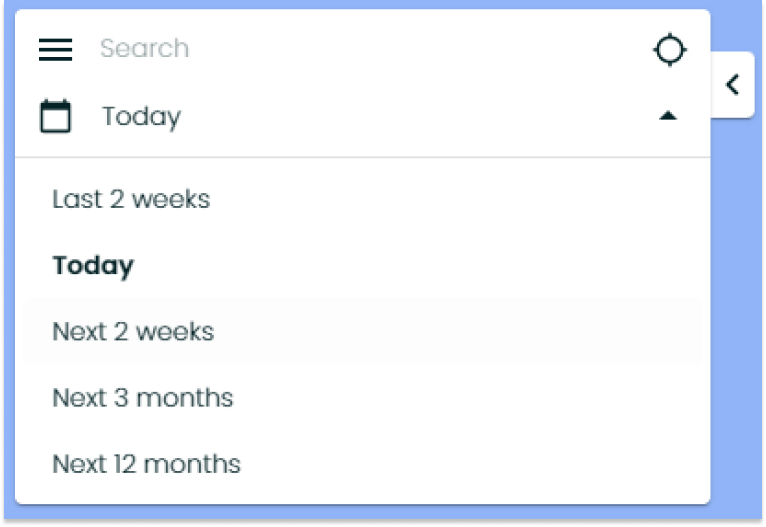
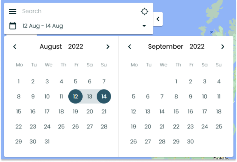
The time, date and location search box which currently exists at the top right of the map will now be situated at the top left of the map and have a more modern look and feel. The functionality will stay the same – aside from the calendar...

Previously when selecting the date period for which you want to view road events, you would need to pick the start and end date on two separate calendars. Now, there will be just one calendar which spans, allowing you to select the dates you want to search for more easily.

The data layers button will now be attached to the time/date/location search on the top left of the map and will have a sleeker, modern hamburger menu icon (three horizontal parallel lines).

If you are a subscriber to our Network Monitor module, you will now see an icon with two cars attached, underneath the time/date/location search box. Clicking this button, will show you the TomTom and Waze buttons so that you can toggle the Network Monitor view on and off.
If you don't subscribe to Network Monitor and would like to learn how it could help your organisation minimise congestion on the road network, you can read more here.

If you are a subscriber to our Traffic Replay module, you will see that the Traffic Replay button is now attached to the bottom left of the time/date/location search box, instead of the top left. Clicking this button will show you the skip forward and back buttons, as well as the time jump buttons alongside the Traffic Replay button.
If you're interested in finding out how subscribing to Traffic Replay could help your organisation learn from past incidents and congestion to better plan for the future, you can learn more here.
All the above mentioned UI changes are highlighted in this video here.

Now we’ve covered off the UI changes, let’s take a look at the developments we’ve introduced to our modules.
Route Manager
First up, our bus route management module, Route Manager, and most importantly, the introduction of future clash detection on bus routes.
Route Manager will now automatically identify where future planned works and closures clash with bus routes. This empowers users to prepare for future disruption by planning temporary diversions and communicating with the public in advance.
Additional updates to Route Manager include two new features:
- Create documentation for permanent bus stops quickly and easily.
- Set up email alerts to update key stakeholders of any changes to bus stops.
Traffic Management
Customers of our Traffic Management module can now add height, weight and width restrictions to Traffic Management plans at Step 2, ensuring plans have the correct restrictions included before submitting for approval.
Traffic Management users will now also find that lane detection is improved when planning lane closures in Traffic Management.
Content Management
Content Management has also received some improvements in this update. Content Management allows utilities and highway authorities to communicate works information to the public more effectively, translating engineering jargon into plain English.
Users can also create Usage Reports to see which of the works they have added works information to using Content Management are getting the most views. In this update, we’ve added the ability to include the names of the works promoters and local authorities conducting the works in these reports, so users can easily identify the organisations conducting the works with high or low views.
Data APIs
Finally, our Data APIs will now include height, weight and width restrictions and our Waze API will additionally incorporate lane closures. We hope this helps improve permit planning and network management!